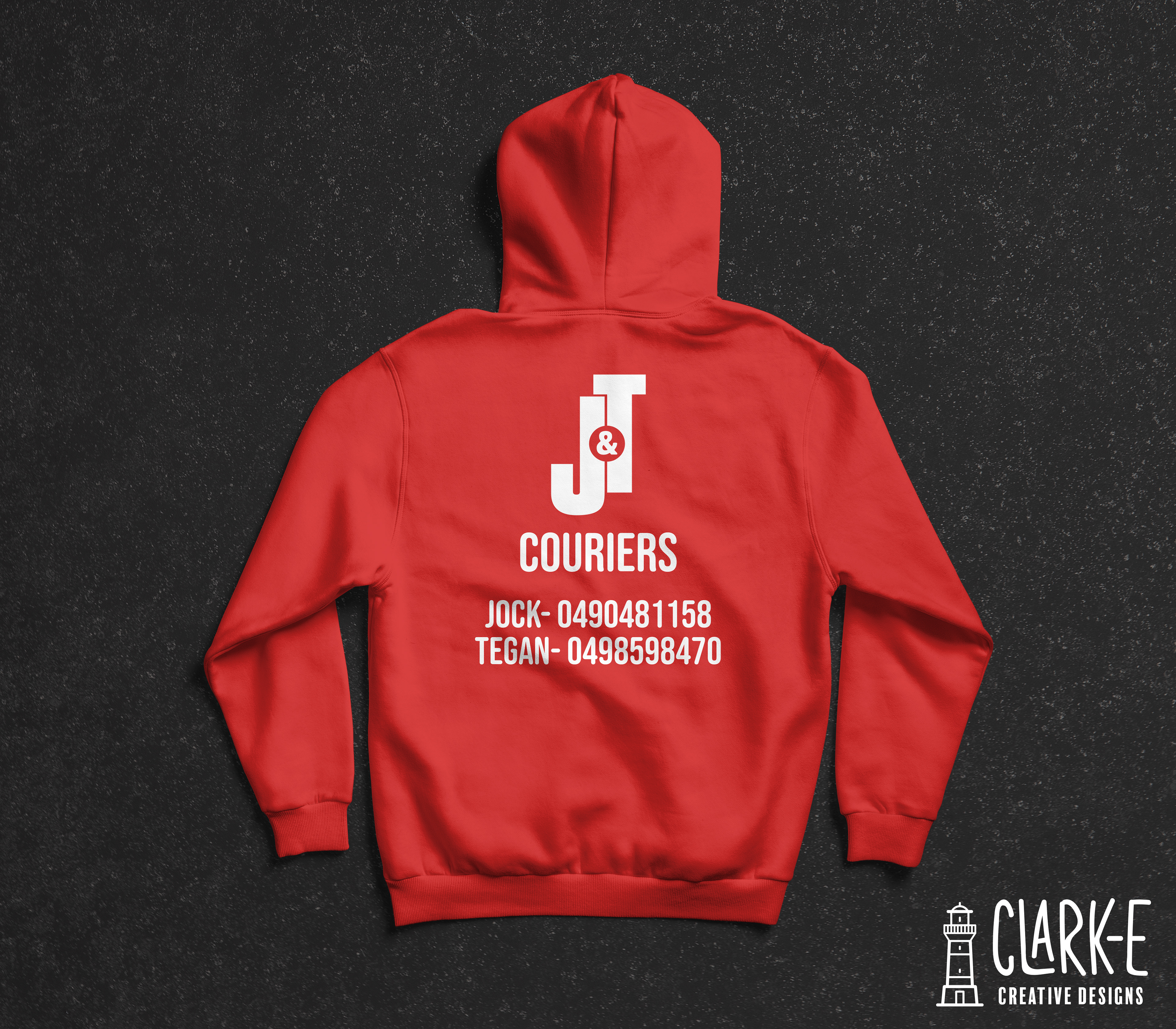
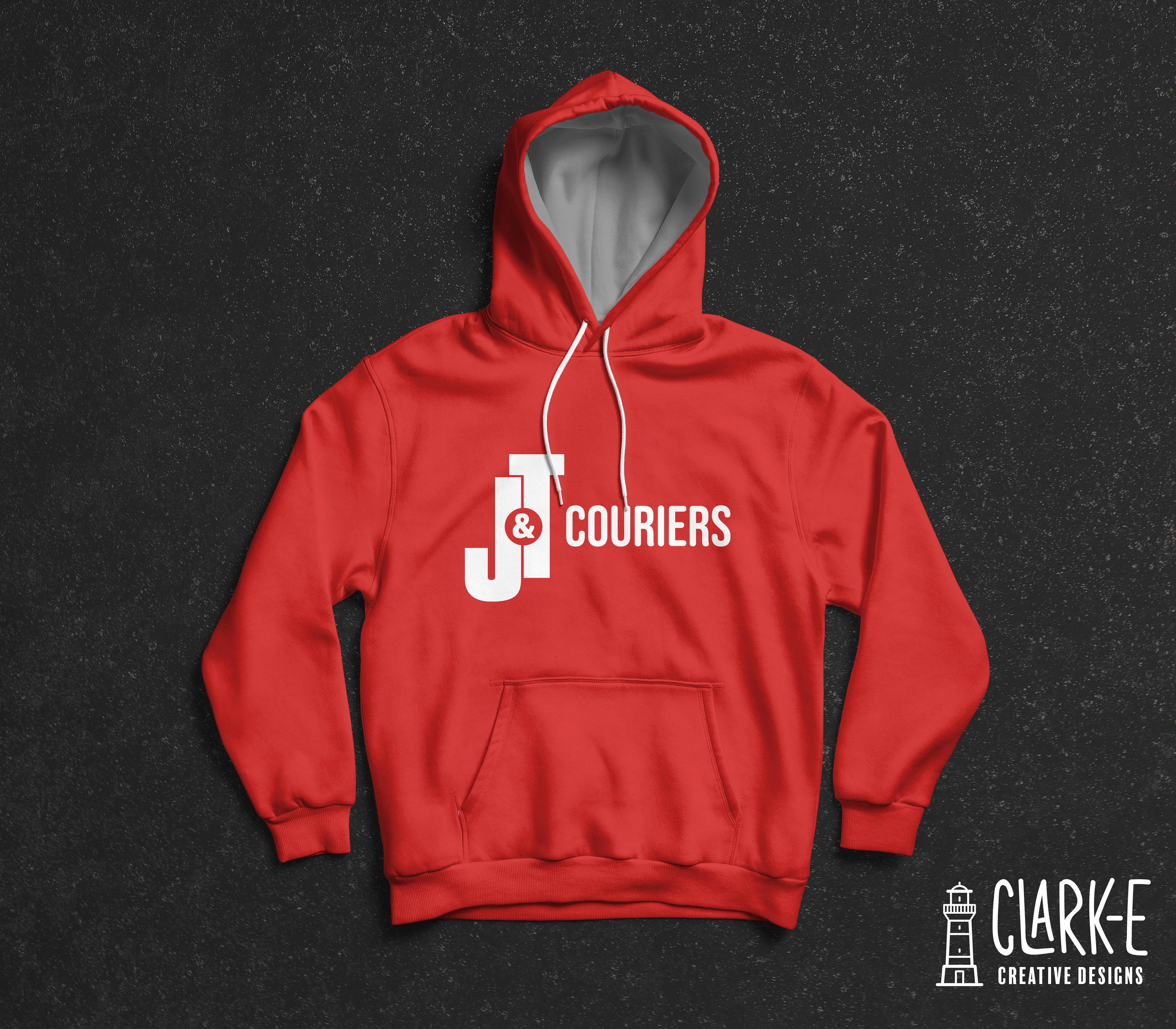
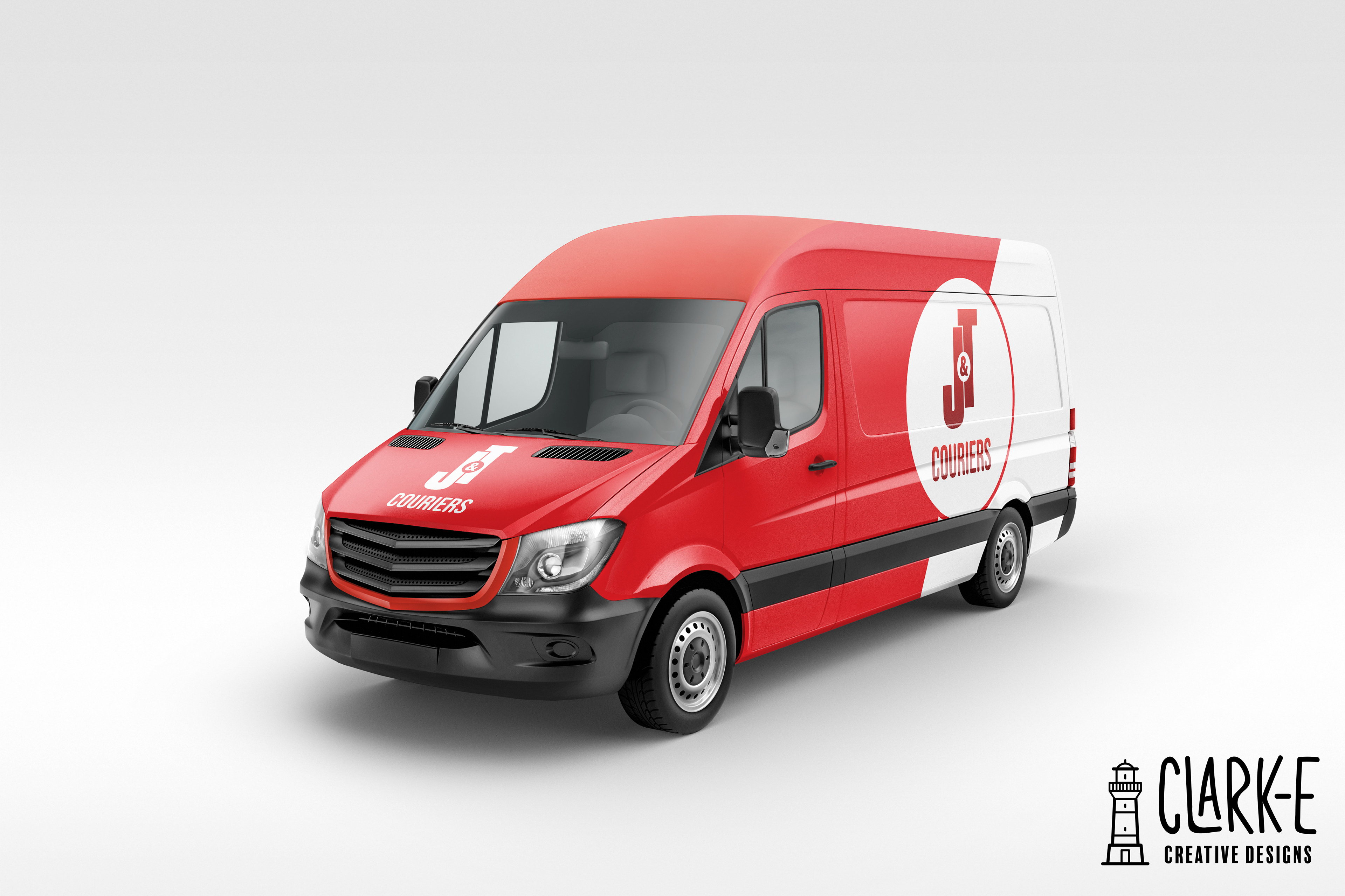
Monogram logos like this one for a graphic designers are often their bread & Butter. This is because when first learning the craft, monograms are easy to manipulate in order to get a range of several different affects and usually require little time to get a really effective result.
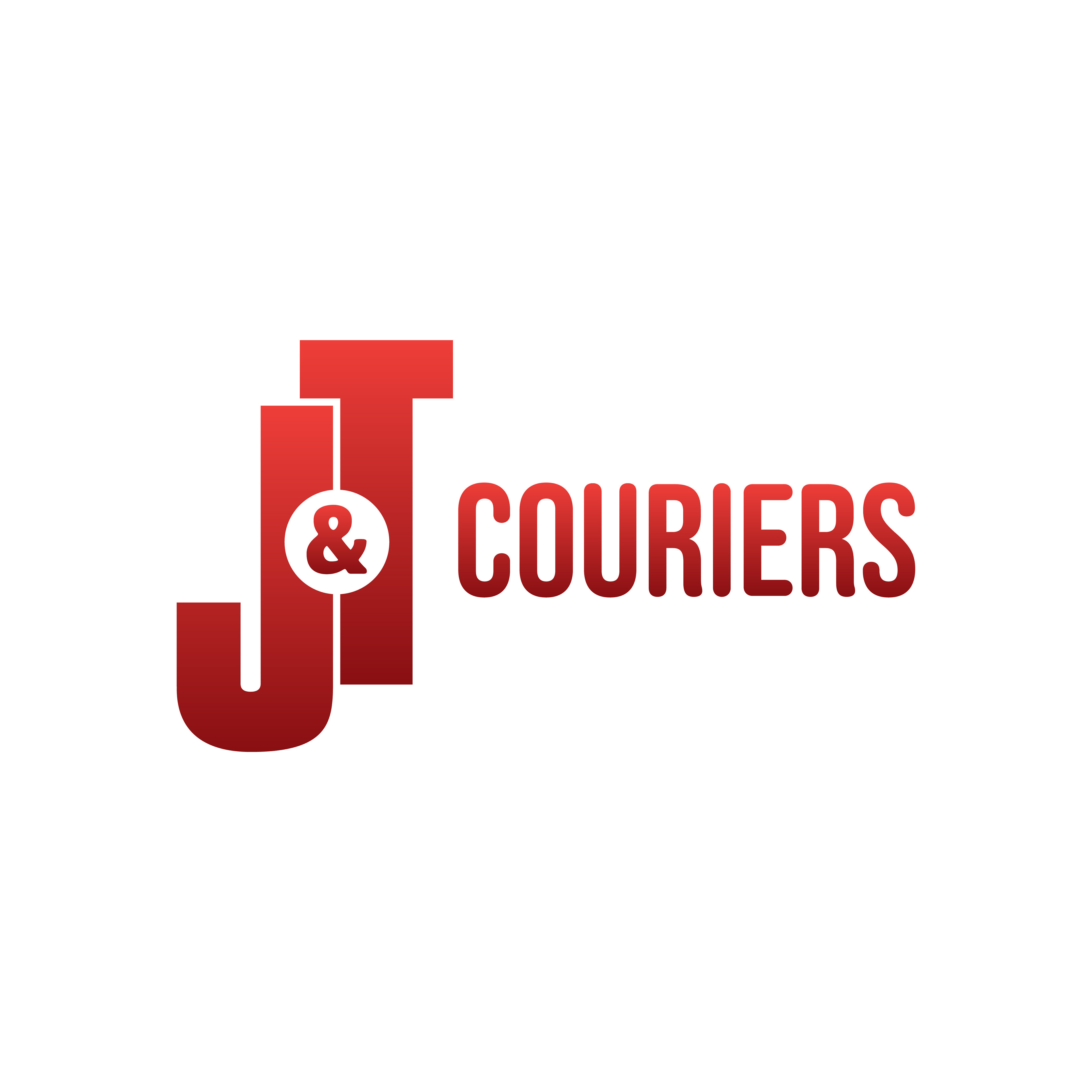

This logo was no different. Whilst simple, it is easily recognised which was at the forefront of the clients mind in providing the design brief. Being a courier service, often the logo is only seen in short glimpses when the van drives by or the delivery person drops of your package. So simplicity was essential and this logo fits the mould perfectly.